First Rand Design System
// Overview
I created this design system to bring FirstRand’s apps (FNB, RMB and WesBank) onto one shared foundation. This design was the my way of giving teams the tools to move through design faster while being consistent to the guidlines and standards. It’s my way of giving all internal and external design teams the tools to move faster, design smarter, and stay consistent with our guidelines and standards.
Multi-Brand Switching
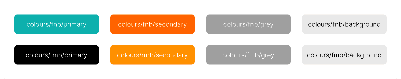
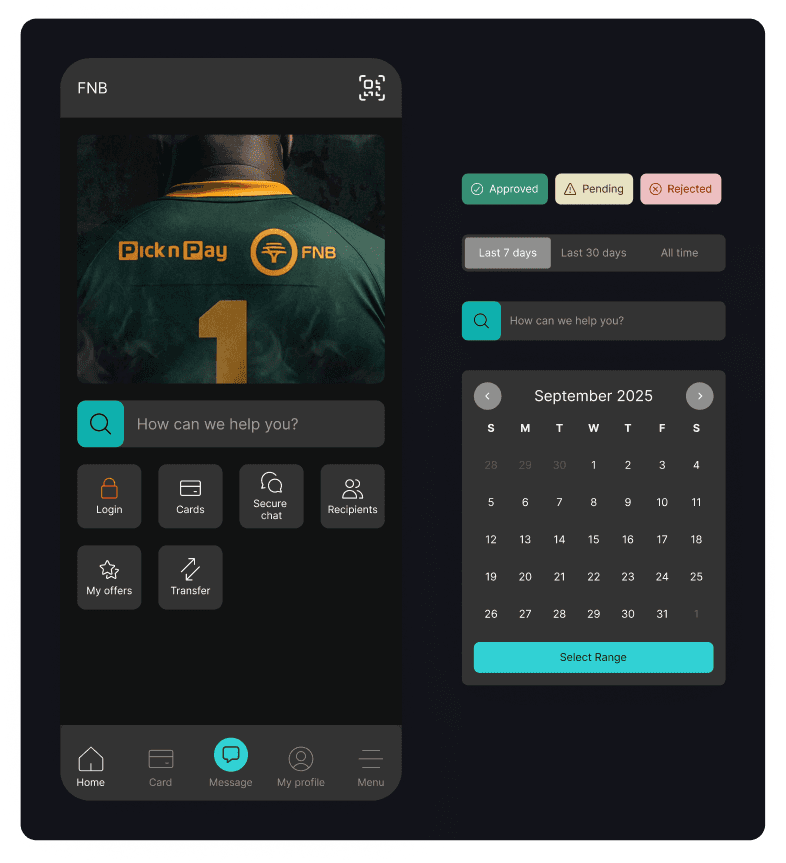
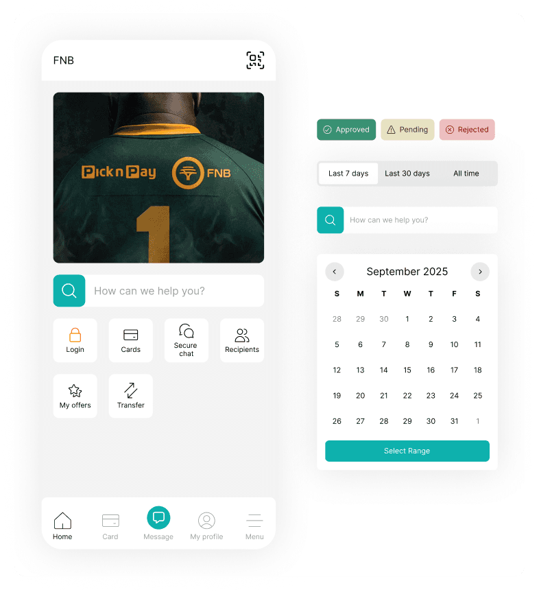
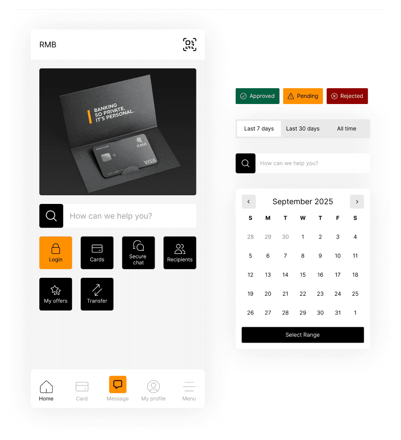
One of the core strengths of the FirstRand App Design System is its ability to switch seamlessly between brands. Each FirstRand brand has its own distinct identity, but the apps are built on one shared foundation. A major challenge was ensuring that switching between brands doesn’t break consistency or force teams to redesign from scratch. To solve this, I built in multi-skin switching using shared variables for colour, typography, and imagery. This allows us to maintain brand individuality while keeping layouts, contrast, and hierarchy consistent. The result is that no matter which app a customer uses, the experience feels familiar while still being true to the brand they trust.
Foundations
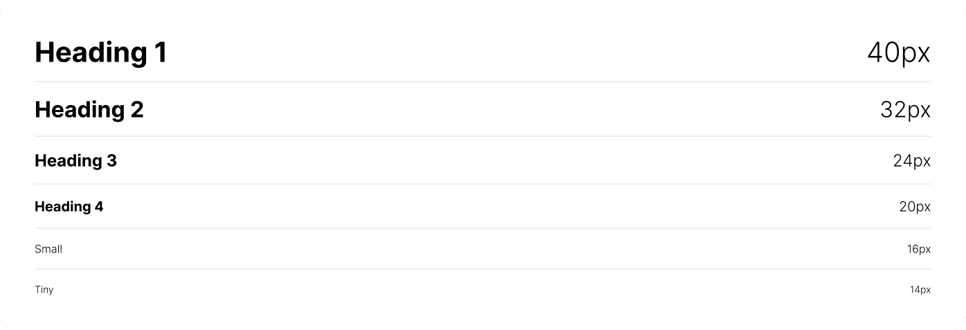
Like most design systems, I included all the essentials such as colour, typography, spacing variables, light and dark mode, layout grids, and a comprehensive component library. But I’ve seen too many design systems overlook these fundamentals. When the basics aren’t done right, the system becomes harder to understand, harder to use, and much harder to build on. One of my main goals with the FirstRand App Design System was to get the basics right. By fixing common issues and focusing on clarity, I created a foundation that’s solid, scalable, and easy for teams to adopt.